In today’s digital landscape, accessibility is no longer optional, it is a fundamental part of modern web design, ensuring that every user can interact with your content seamlessly.
Color contrast is one of the most critical elements of accessible design, playing a key role for creating inclusive digital experiences. A color accessibility checker helps ensure that your website is readable, inclusive and compliant with global standards such as WCAG.
This article explores what a color accessibility checker is, why color contrast is crucial, how to test it effectively and the tools that can help you achieve full accessibility compliance.
What Is a Color Accessibility Checker?
A color accessibility checker is a tool that evaluates the contrast between foreground (usually the text color) and background colors on a website or app. Its purpose is to determine whether color combinations meet accessibility standards for users with visual impairments, including color blindness and low vision, while still maintaining visual appeal.
These tools measure the contrast ratio (the level of difference in brightness between text and its background, expressed as a value from 1:1 to 21:1) and determine whether the color combination meets WCAG accessibility requirements (for example, a minimum of 4.5:1 for normal text), ensuring that content is readable for as many users as possible.
Designers, developers and accessibility specialists rely on accessibility color checkers to prevent common accessibility issues that may lead to user exclusion or even legal risk.
Why Color Contrast Matters in Web Accessibility
Color contrast directly affects how easily users can read and understand the content. Poor contrast can make websites difficult or impossible to use for people with visual impairments, while also negatively impacting the experience for all users.
Additionally, low contrast can make text unreadable, buttons hard to see, and page navigation confusing.
From a compliance standpoint, failing to meet contrast requirements may result in a site that does not comply with WCAG and may also put organizations at risk of non-compliance with accessibility regulations such as the European Accessibility Act (EAA).
A reliable color contrast accessibility checker helps you:
- Enhance readability and make content easier to perceive and understand;
- Support users with visual impairments and low vision;
- Reduce the risk of accessibility-related legal issues;
- Strengthen your brand’s reputation for inclusion.
Keeping accessible contrast in mind is not only a technical requirement, it is also a fundamental aspect of user-centered design.
How to Check Color Accessibility Step by Step
Testing color contrast systematically is key to creating an accessible website. To help ensure your design meets accessibility standards, here’s a simple process to check color accessibility accurately:
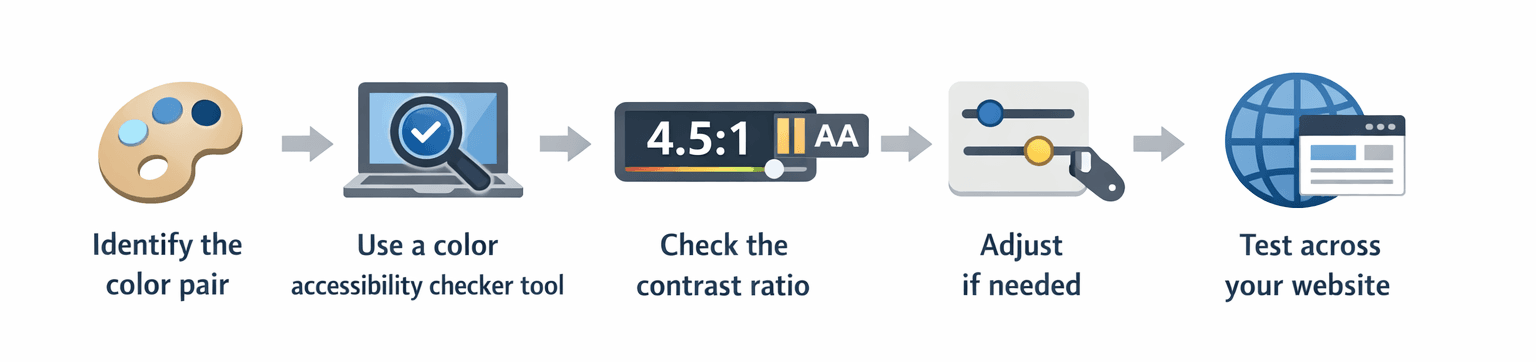
1. Identify the color pair
Choose the foreground (text) and background colors you want to test.
2. Use a color accessibility checker tool
Enter the color values (HEX, RGB or via picker) into the tool.
3. Check the contrast ratio
The tool will display the contrast ratio and indicate whether it passes WCAG AA or AAA standards (explained in detail in the WCAG Color Accessibility Requirements section sections).
4. Adjust if needed
If the combination fails, tweak brightness, saturation, or darkness until it meets the required contrast.
5. Test across your website
Apply this process to buttons, links, forms, images with text and all navigation elements.
This step-by-step approach ensures your design is accessible from the start, avoiding the need for corrections later.
Best Tools for Color Accessibility and Contrast
Choosing the right color checker accessibility tool can make all the difference. Here are some of the most reliable options:
There are many tools available to support accessibility validation, but these are some of the best for testing everything, from single color pairs to full website layouts.
One of the most respected global references in this field is Deque Systems. Their tool, Axe for Designers, is widely recognized, and Deque itself is a leader in digital accessibility software and consulting. They provide enterprise-grade solutions for automated testing, manual auditing and continuous accessibility monitoring.
Beyond Deque, accessibility validation can be enhanced by combining different types of tools, depending on your workflow:
- Online color contrast accessibility checkers for quick validation;
- Browser extensions for real-time testing;
- Full website accessibility scanners for large platforms;
- Color reader and vision simulation tools to test real-world usability.
Using a mix of automated and manual tools is the most reliable way to ensure consistent accessibility across your digital products.
WCAG Color Accessibility Requirements
To ensure accessibility compliance, websites must follow contrast rules defined by WCAG (Web Content Accessibility Guidelines), which are also used as a reference in legal frameworks such as the European Accessibility Act (EAA).
According to WCAG 2.2, key contrast requirements include:
- AA
- Normal text: minimum contrast ratio of 4.5:1
- Large text: minimum contrast ratio of 3:1
- AAA
- Normal text: 7:1
- Large text: 4.5:1
For web typography, “large text” generally means 18 pt and above (≈ 24 px / 1.5 rem) or 14 pt and above in bold (≈ 19 px / 1.2 rem). Anything smaller is considered normal text.
Additional best practices include:
- Never relying on color alone to convey information;
- Ensuring sufficient contrast for links, buttons and form inputs;
- Testing images with embedded text using accessibility image checkers;
- Verifying focus states and hover effects.
Understanding contrast levels and applying proper text contrast is essential not only for legal compliance under the EAA, but also for creating a usable and inclusive digital experience.
How to check color contrast for accessibility?
A color accessibility checker tool can be used to input text and background colors and verify whether the contrast ratio meets WCAG AA or AAA standards.
What is the best color accessibility checker?
WebAIM Contrast Checker and Colour Contrast Analyser are among the most accurate and widely used. Additionally, Axe for Designers: a free accessibility plugin from Deque, is also a key reference, as Deque is a leading authority in digital accessibility.
What are WCAG color contrast requirements?
WCAG AA requires a minimum contrast of 4.5:1 for normal text and 3:1 for large text, while WCAG AAA has stricter requirements: 7:1 for normal text and 4.5:1 for large text.
How to make a website color accessible?
Keep in mind to use accessible color palettes, test all color combinations with a checker, avoid relying on color alone to convey meaning, and validate against WCAG standards.
Conclusion
Using an accessible color checker and a color palette accessibility checker is essential for creating inclusive and legally compliant digital experiences. By removing barriers for users with disabilities, these tools ultimately benefit everyone. Color contrast affects readability, usability, compliance and trust, and it should be validated at every stage of the design and development process.
At Mediaweb, accessibility is treated as a strategic advantage rather than a limitation. Through structured audits, expert consulting, and practical implementation aligned with WCAG and EAA, and supported by industry-leading tools such as those from Deque Systems, we help brands create digital experiences that are accessible, compliant and future-ready.
Remember, accessibility is no longer a nice-to-have, it is the standard for digital experience excellence.