
OutSystems solves a real problem: delivering complex applications in less time. But that doesn't guarantee those applications can be used by everyone. In practice, accessibility is still treated as a phase, something that comes after the flows are closed and the business logic validated, and that moment rarely arrives with the time or space to be done properly. The platform isn't the obstacle: OutSystems has what it takes to support truly accessible interfaces. What's missing is process, knowing where to intervene, how, and when.
In recent audits of applications built on OutSystems, we identified several accessibility issues, almost half of them critical, meaning they made the application completely unusable via keyboard or screen reader. This article focuses on the three most recurring patterns: forms without semantic association, interactive components with incomplete ARIA, and keyboard navigation failures. Concrete problems, with concrete solutions, without rebuilding what already exists.
First things first: enable EnableAccessibilityFeatures
OutSystems UI has an input parameter on layouts (EnableAccessibilityFeatures) that, when enabled, turns on a set of essential accessibility features: visible focus indicators, skip-to-content, accessible links, and improved contrast. The examples in this article were tested against WCAG 2.2 AA with OutSystems UI v2.28.1.
A scenario that repeats often: during a demo, the client notices an outline appearing around buttons and menus on click. "Can you remove this?" The fastest (and most common) answer is to set the parameter to False. The problem disappears from the screen. So does accessibility, significantly increasing the risk of non-compliance with WCAG criteria related to visible focus, navigation, and content access (regardless of the work done at the component level).
Enabling EnableAccessibilityFeatures establishes an important baseline (focus indicators, skip-to-content, contrast), but it doesn't automatically fix component semantics, focus management in modals, or the association between fields and error messages. The following sections assume this parameter is on.
1. Forms: the label is visible, but not associated
This is probably the most common problem in OutSystems projects, and almost always for the same reason: the Label widget was placed visually next to the Input, it looked fine on screen, it passed review, and it was assumed that was enough. It isn't.
Labels without programmatic association
Visual proximity doesn't create programmatic association. A sighted user reads the field and the label together and understands the relationship. A screen reader navigates the DOM, and if the link doesn't exist in the code, the field is announced with no name. In long forms, the user encounters a sequence of anonymous fields with no way to tell what to fill in each one.
For the association to exist, the <label> needs the for attribute pointing to the input's id:
HTML
<label for="Input_Name">Name</label>
<input type="text" id="Input_Name" />
In OS11, this link is created using the Label widget's Input Widget property.
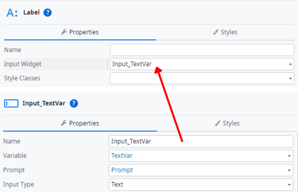
One detail that catches a lot of people out: the id generated by OutSystems is dynamic and can change after publish. The association should be validated in the final output, not just in Service Studio.
Error messages without field context
The second problem in this section is less visible but just as frequent: the inline validation error messages generated by OutSystems don't, by default, include the association to the field. The accessibility requirement is simple, the message must be linked to the field via aria-describedby, but in OutSystems that link has to be added manually. The screen reader user hears the error but doesn't know which field it belongs to. In forms with active validation, this makes fixing errors practically impossible without sight.
How to test
Open NVDA or VoiceOver (iOS and macOS), TalkBack (Android), or JAWS in an enterprise context. Then navigate to each field with Tab and check what's announced. If you only hear the field type, "edit", with no name, the association is missing. Enter invalid data and submit the form: the error messages should be announced alongside the corresponding field. If you hear the errors somewhere on the page but with no field context, aria-describedby is absent.
Note: for best results, the following test combinations are recommended: NVDA + Firefox and JAWS + Chrome.
2. Interactive components: incomplete or missing ARIA
There's a specific trap in OutSystems here: native components as Popup, Bottom Sheet, Tabs, have a polished appearance and correct visual behavior. That creates a confidence that isn't always justified. What's on screen doesn't necessarily reflect what's in the DOM, and it's the DOM that the screen reader reads.
Modals and panels: focus with no management
The most frequent case we find is the Popup or Bottom Sheet opening with no focus management: the modal appears, the content is visible, but keyboard focus stays on the page underneath. The screen reader user keeps navigating the previous content with no idea that anything has changed. This behavior has to be implemented explicitly, including the focus trap, which ensures focus can't leave the modal while it's open.
A modal needs to include, at minimum:
HTML
<div class="modal" role="dialog"
aria-modal="true"
aria-labelledby="modal-title">
<div id="modal-title" class="modal-header">
Confirm action
</div>
<div class="modal-body">...</div>
</div>
In OutSystems, this isn't automatic: the focus trap must be implemented via JavaScript.
In Service Studio, create a PopupLayout block with the structure of the Popup's content, which will be placed inside the OutSystems UI Popup Built-in Widget. In the PopupLayout block, an OnInitialize event should be added with a JavaScript node containing the following code:
JavaScript
const wrapper = document.getElementById($parameters.WrapperId);
if (!wrapper) {
console.warn("[FocusTrap] Wrapper not found:", $parameters.WrapperId);
} else {
const FOCUSABLE = [
'a[href]',
'area[href]',
'input:not([disabled]):not([type="hidden"])',
'select:not([disabled])',
'textarea:not([disabled])',
'button:not([disabled])',
'iframe',
'object',
'embed',
'audio[controls]',
'video[controls]',
'summary',
'[tabindex]:not([tabindex="-1"])',
'[contenteditable]:not([contenteditable="false"])'
].join(',');
const isReachable = (el) =>
el.getClientRects().length > 0 &&
getComputedStyle(el).visibility !== 'hidden' &&
!el.hasAttribute('inert') &&
!el.closest('[aria-hidden="true"]');
const getFocusable = () =>
Array.from(wrapper.querySelectorAll(FOCUSABLE)).filter(isReachable);
const controller = new AbortController();
wrapper.addEventListener('keydown', (e) => {
if (e.key !== 'Tab') return;
const items = getFocusable();
if (items.length === 0) {
e.preventDefault();
return;
}
const first = items[0];
const last = items[items.length - 1];
if (e.shiftKey && document.activeElement === first) {
e.preventDefault();
last.focus();
} else if (!e.shiftKey && document.activeElement === last) {
e.preventDefault();
first.focus();
}
}, { signal: controller.signal });
wrapper._focusTrapAbort = controller;
}
It is also necessary to add the has-accessible-features class to the Popup. This ensures that, when the modal opens, focus moves to the first interactive element inside it, and when it closes, focus returns to the element that triggered it. Focus should not be able to leave the modal using Tab while it is open.
Tabs: correct visual structure, incomplete ARIA
The problem isn't limited to modals. In Tabs, the visual structure is correct, but the ARIA structure isn't always complete by default. To comply with the W3C ARIA Authoring Practices Guide, each tab button needs role="tab", aria-selected and aria-controls, and those buttons must sit inside a container with role="tablist". The content panel needs role="tabpanel", and the panel must have aria-labelledby pointing to the corresponding tab. A tab that's visually selected can be programmatically indistinguishable without these attributes.
Forge and custom components: lists with unannounced options
In Forge and custom components, the pattern is different but just as common: role="listbox" on the container without role="option" on the items. The screen reader announces that a list exists but can't read what's inside it.
OutSystems' extended properties make adding ARIA attributes straightforward once you know what to add. The mechanism exists, it's a real advantage of the platform. What's missing is knowing exactly what each pattern requires.
How to test
Inspect the DOM with the modal open: check whether role="dialog", aria-modal and aria-labelledby are present and correct. Open the modal with the keyboard and confirm that focus moves into it immediately and that it's not possible to leave it with Tab without closing it. On close, focus should return to the element that triggered the opening.
For Tabs, navigate between them with the arrow keys and check what the screen reader announces. It should indicate which tab is active and how many there are, for example, "Details, tab selected, 1 of 3." For dropdowns, open the list and go through the items: if the screen reader only announces "list" without reading the options, role="option" is missing.
3. Keyboard navigation: invisible or trapped focus
These are two distinct problems that are often confused, and it's worth separating them because they have different causes and solutions.
Invisible focus
This is the most common and the fastest to fix. In many OutSystems projects we review, EnableAccessibilityFeatures is set to False, and that alone suppresses focus indicators across the whole application. What's left to do afterward is make sure CSS overrides in the custom theme or Forge components don't suppress the outline again. For that fine-tuning, there's a standard CSS technique (not OutSystems-specific) that resolves this systematically: :focus-visible, applied at the theme level.
CSS
:focus-visible {
outline: var(--border-size-m) solid #005FCC;
outline-offset: 2px;
}
The advantage of :focus-visible over plain :focus is that the indicator appears for keyboard users but not for mouse interactions, which removes the aesthetic objection without compromising accessibility.
Note: minimum contrast criteria must be considered, the focus indicator only needs 3:1 against the background, per 1.4.11 Non-Text Contrast.
Trapped focus
This one is more insidious. In OutSystems, it typically happens in the Side Panel, in the Popup, and in mobile navigation menus with entrance animations. Focus enters the component but isn't contained, or is contained but with no way out. The keyboard user gets stuck with no visual indication of what happened. This problem is completely invisible in visual review and in automated tests. It only shows up when running manual keyboard tests.
A note on Forge components that applies to both problems: being well-rated or widely used is no guarantee of compliance. We regularly see popular Forge components with invisible or trapped focus. Any Forge component should be explicitly tested before going into production, not assumed to be accessible.
How to test
Go through the whole application with Tab, Shift+Tab, Enter, Space, and the arrow keys. Focus should always be visible and the path should be logical. For trapped focus: open a Side Panel or Popup and try to close it with Escape. If Escape doesn't work, or if focus leaves the component without closing it, there's a problem. If at any point it's unclear where focus is, even with your eyes on the screen, the component fails.
Quick checklist before publishing
Before considering an application ready, confirm:
- EnableAccessibilityFeatures is enabled on the applicable layouts;
- Labels and fields are programmatically associated (for / id);
- Error messages are linked to fields via aria-describedby;
- Modals and panels manage focus on open and close (focus trap);
- Tabs, dropdowns, and custom components have the full ARIA structure (role, aria-selected, aria-controls, etc.);
- Focus is always visible and the keyboard navigation order is logical;
- Forge components have been manually tested, not assumed to be accessible.
What changes when this is handled from the start
Accessibility doesn't slow projects down, even less so in OutSystems. It's the lack of process that slows them down, when problems surface late, in an audit, in production, or in a complaint.
What this article describes isn't exceptions or edge cases. These are recurring patterns. Audit data across several OutSystems applications shows a consistent pattern: forms without semantic association, unmanaged focus, and components with incomplete ARIA are systematically among the most frequent issues.
Building fast in OutSystems is the first step. Building for everyone happens at the same time, if we know where to look.
Technical references
WCAG 2.2 - conformance criteria
WAI-ARIA Authoring Practices Guide - Dialog (Modal) Pattern
WAI-ARIA Authoring Practices Guide - Tabs Pattern
OutSystems Documentation - Accessibility (EnableAccessibilityFeatures)
What does EnableAccessibilityFeatures do?
It's an input parameter on the layout block. Set to True, it enables a baseline set of accessibility features on OutSystems UI layouts: visible focus indicators, skip-to-content, accessible links and better contrast. It doesn't fix component semantics, modal focus or field-error associations on its own.
Why aren't form labels read by screen readers?
Visual proximity between a Label and an Input doesn't create a programmatic association. In OS11, that link comes from the Label widget's Input Widget property. Since the generated id can change after publish, validate the association in the final output, not just in Service Studio. Error messages must also be linked to their field via aria-describedby, something OutSystems doesn't add by default.
Does OutSystems manage modal focus automatically?
Partly. If the Popup carries the has-accessible-features class, the platform moves focus into the popup on open and returns it to the trigger element on close. What it doesn't do is trap focus. The focus trap has to be added manually via JavaScript. The "has-accessibility-features" class isn't inherited from the layout parameter, it has to be added to the Popup widget's Style Classes.
What ARIA do OutSystems Tabs need?
The Tabs pattern isn't fully ARIA-compliant by default: role="tabpanel" doesn't align with the semantic <article> element used for the panels. OutSystems documents a fix, keep the <article> structure and move the accessibility attributes to an inner <div>, applied via a JavaScript node on OnReady. Verify against your OutSystems UI version, since the behaviour has changed across releases.
What to check before publishing for accessibility?
EnableAccessibilityFeatures on, labels linked via for/id, errors linked via aria-describedby, modals manage focus, Tabs/components have full ARIA, focus always visible, Forge components manually tested.